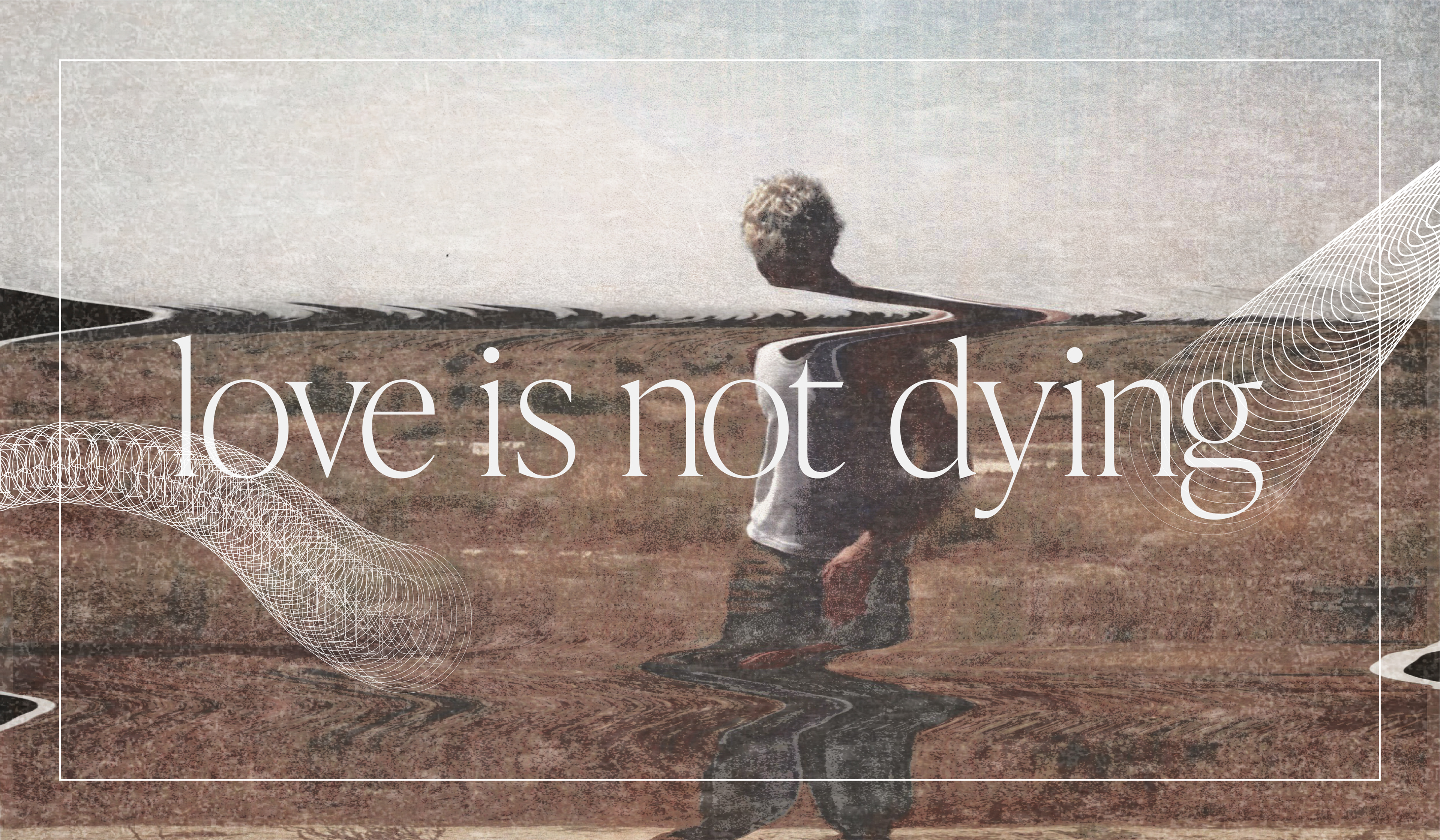
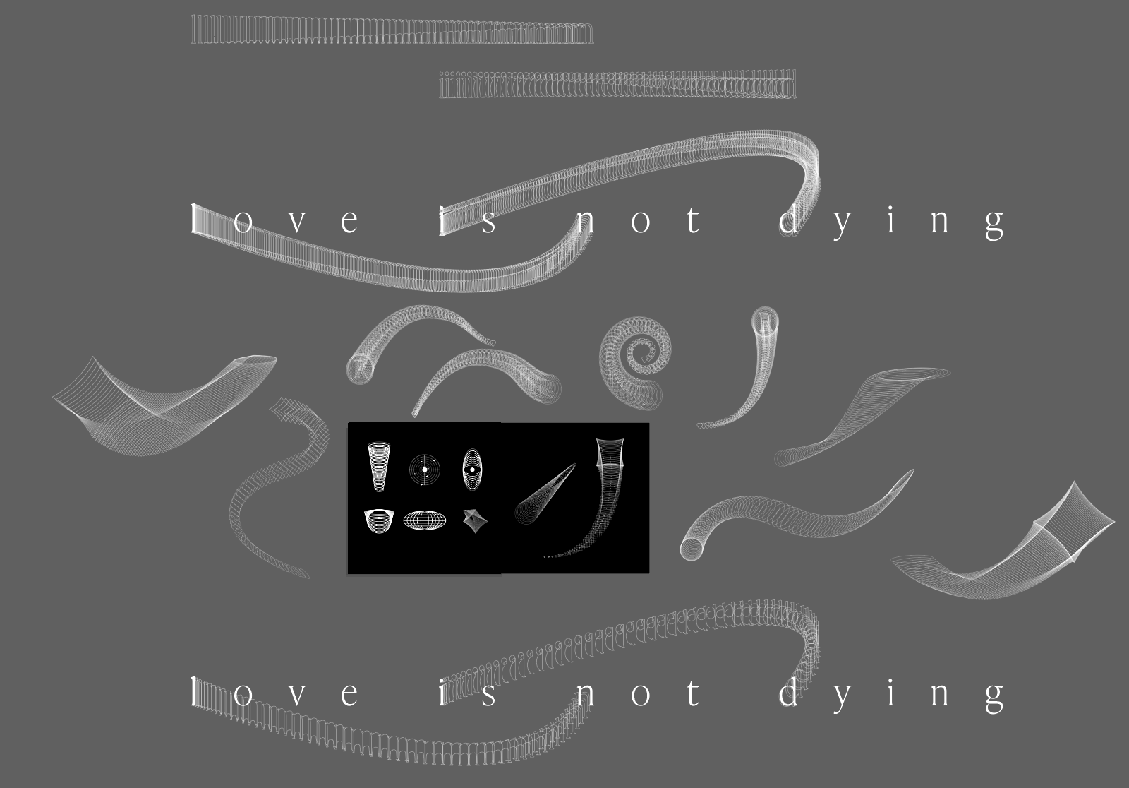
love is not dying (lind) is a personal visual system rebrand aimed to capture the chaotic etherealness of the production, lyrics, and stillness of lind.
Challenge
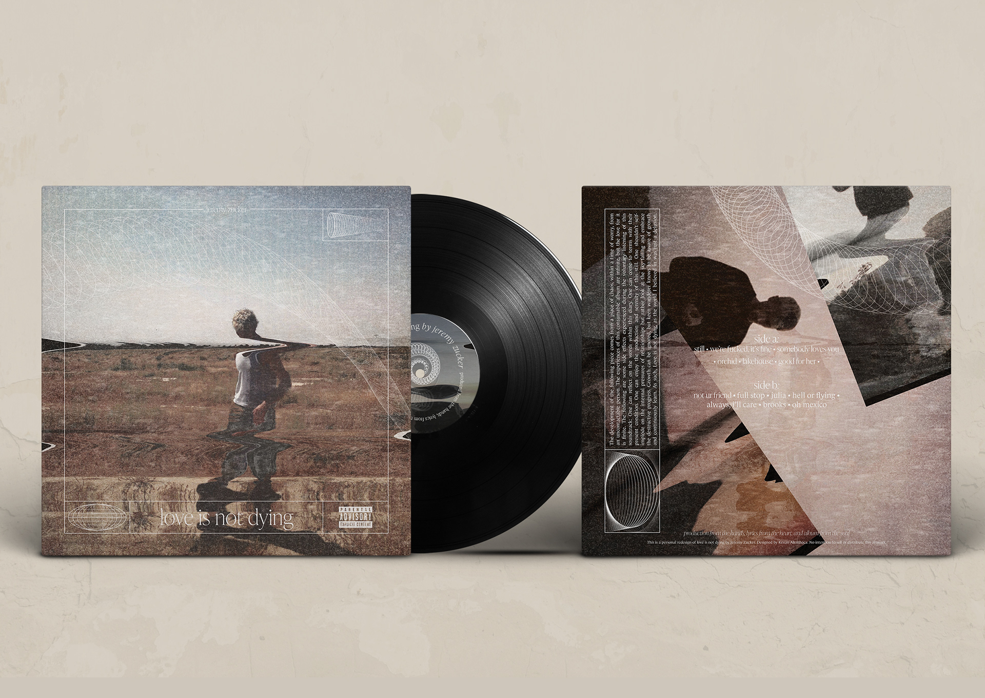
The objective is to translate the perceived identity of music into a visual system. love is not dying by Jeremy Zucker was chosen to elevate its visual identity to have a more cohesive and connective system. In addition, I was responsible for creating collaterals and supporting media, along with the album design, to demonstrate a flexible brand system.
Scope of Work
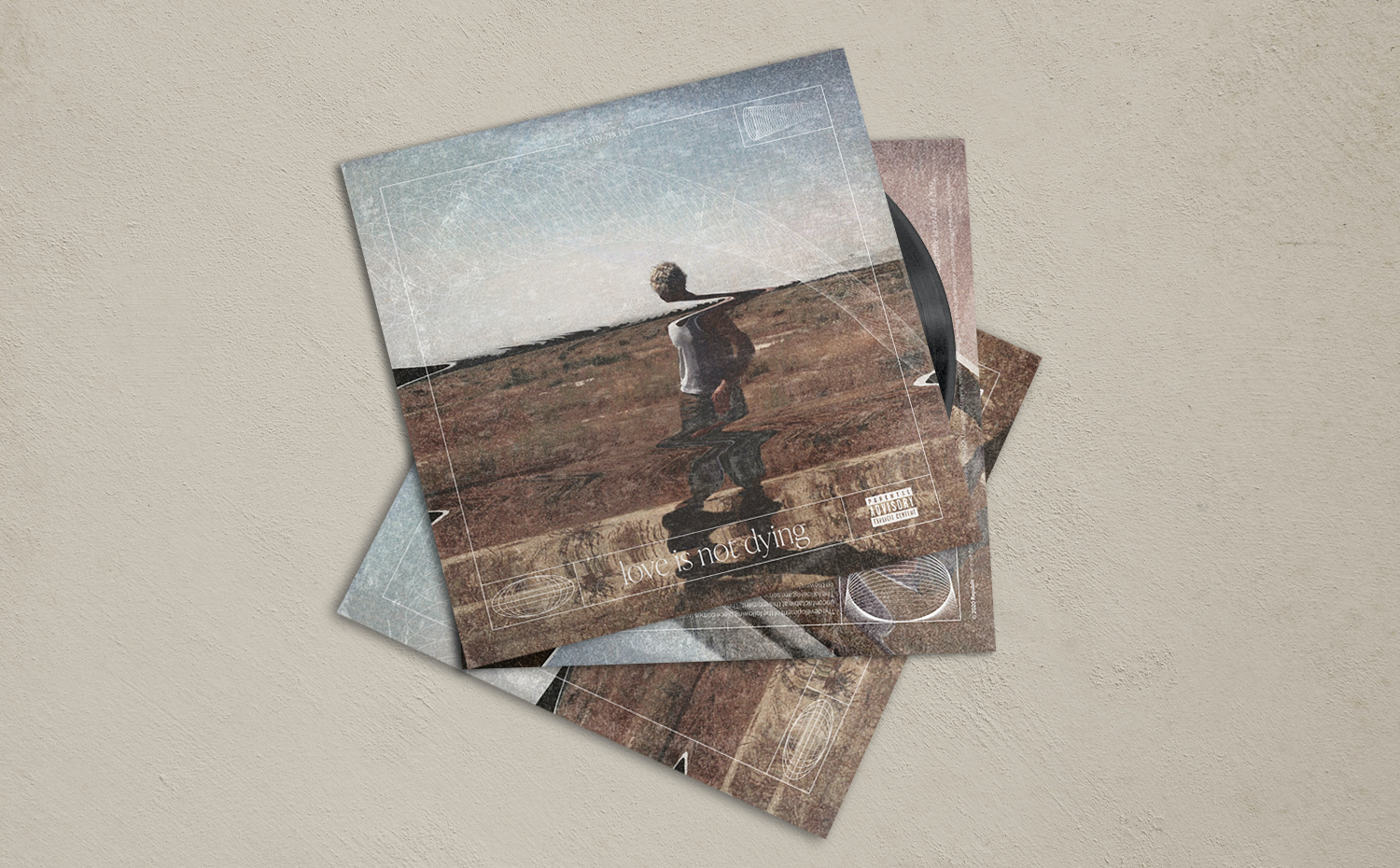
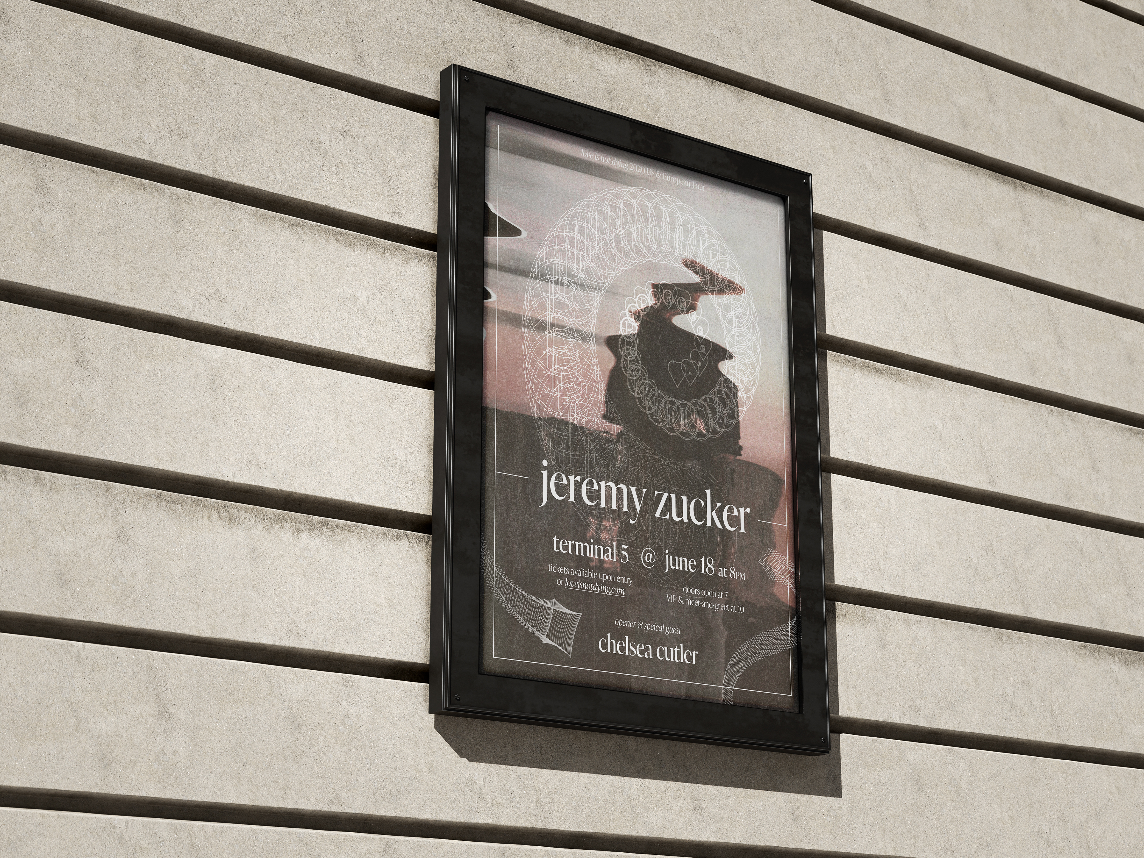
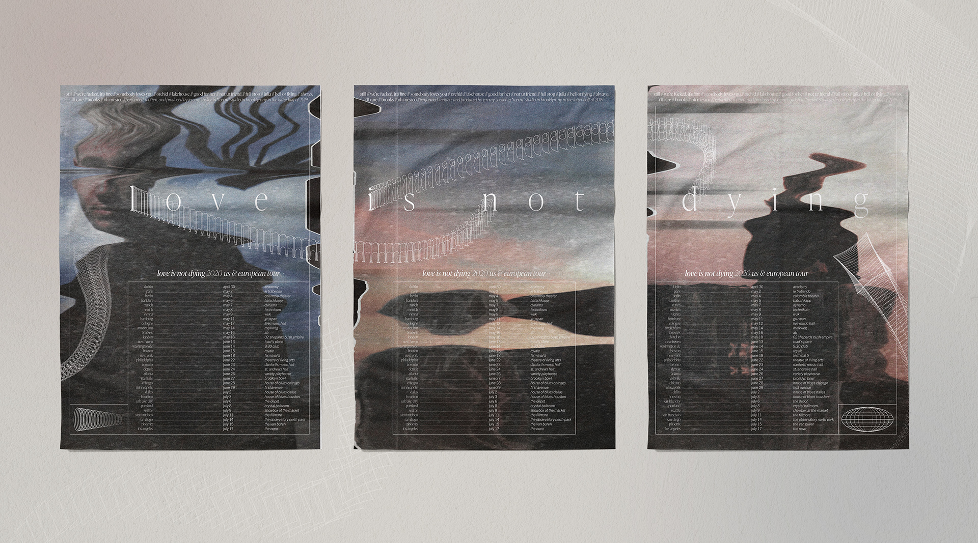
Print Design: Vinyl Album Cover, Poster
Research and Target Audience
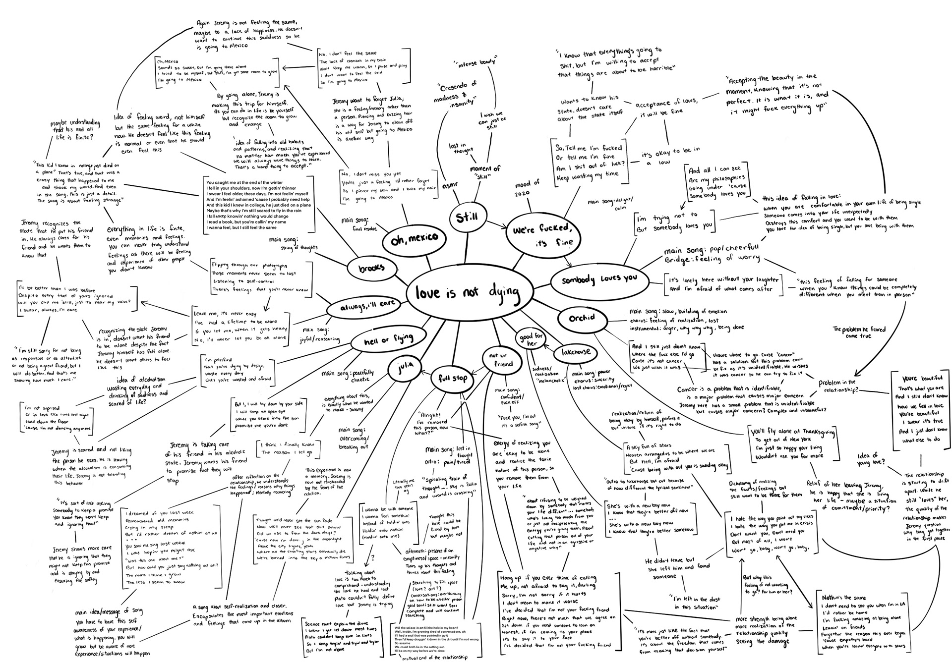
Visual System Development
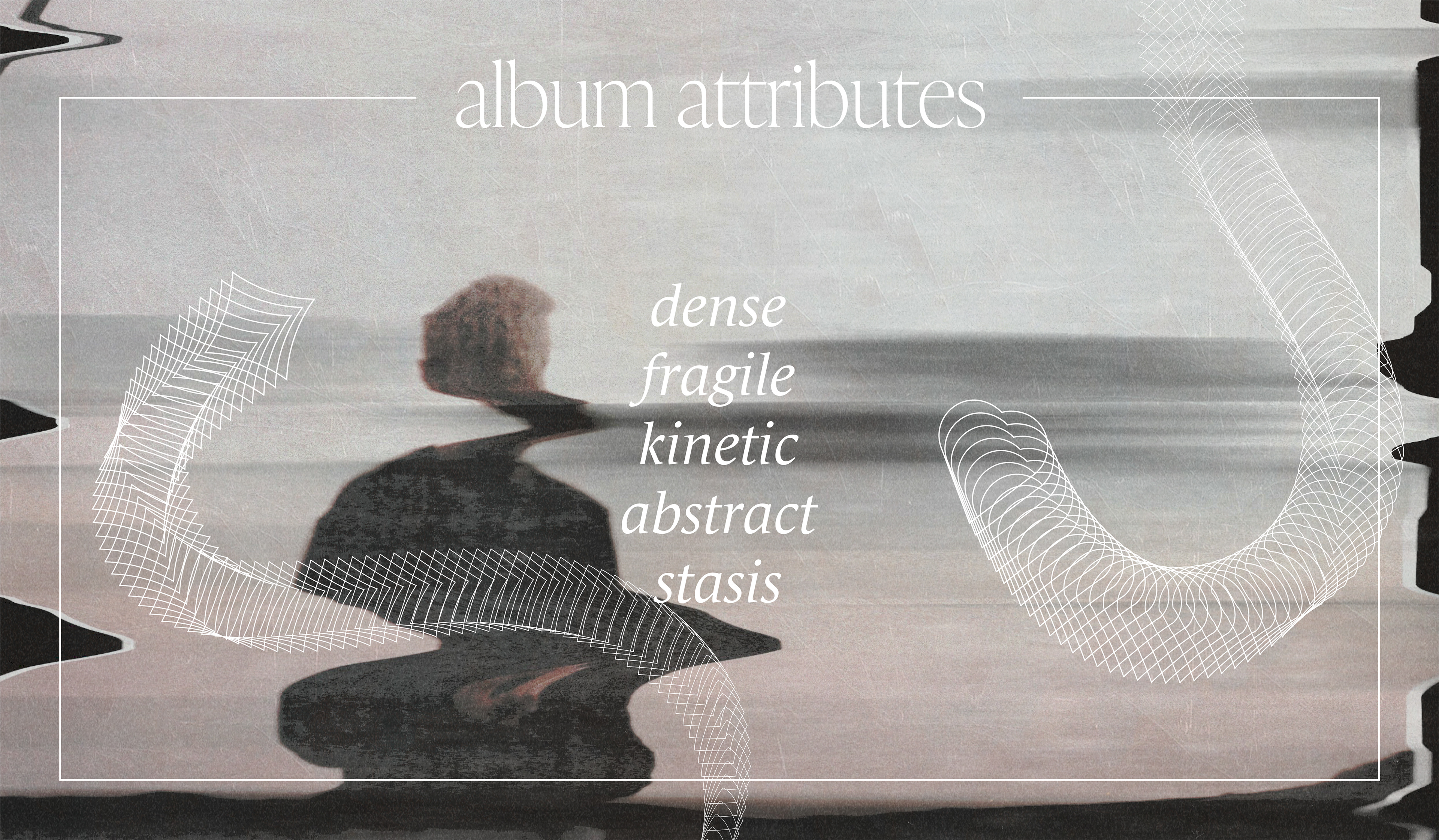
The goal is to improve the visual system. The album is from the heart; a strong narrative of the artist with a delicate, complex production. These aspects were used across different media with a focus on consistency.
Direction
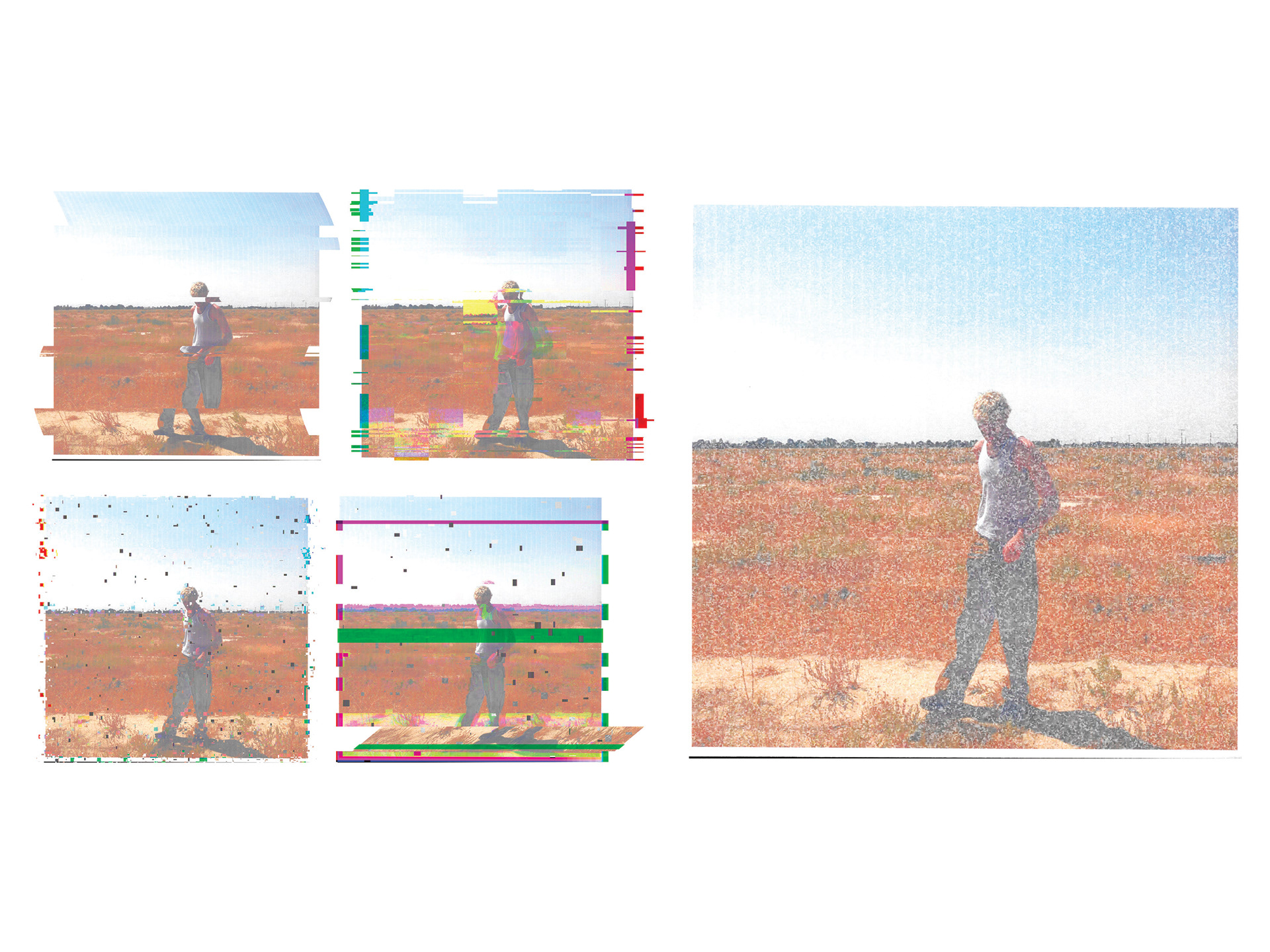
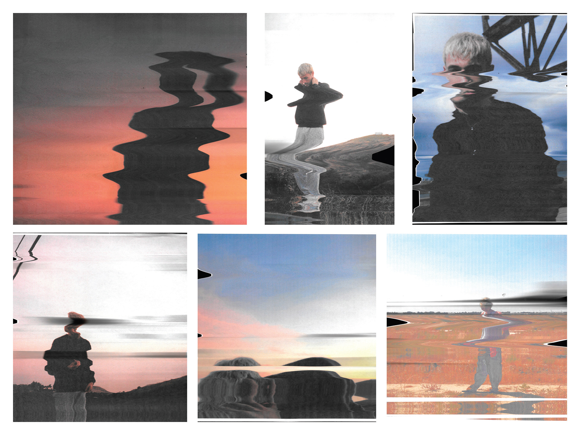
The current visual language of love is not dying doesn't hold cohesively across different media from print, digital, and merch. After repeatedly listening to the album (~100 times), I created a system that focused on features of photography, simple line framework, and texture work to capture the sense of complexity yet simplicity displayed in the album. These focuses are flexible and can be repeated and adjusted to different media, allowing for a more cohesive system.
love is not dying features a production that is experimental, textural, yet fluid. The visual system was developed to create an atmosphere of orderly chaos, as demonstrated by Zucker's production.
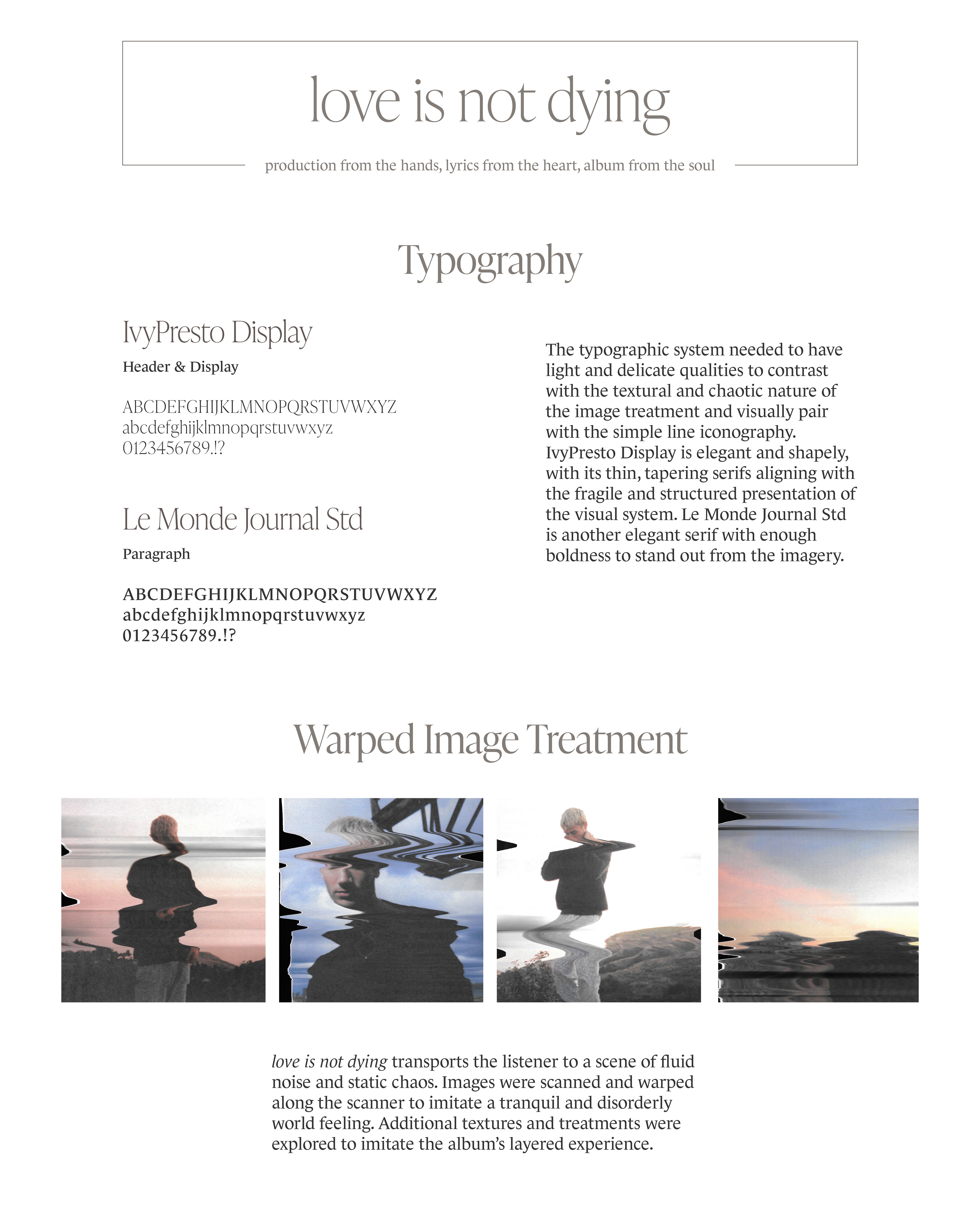
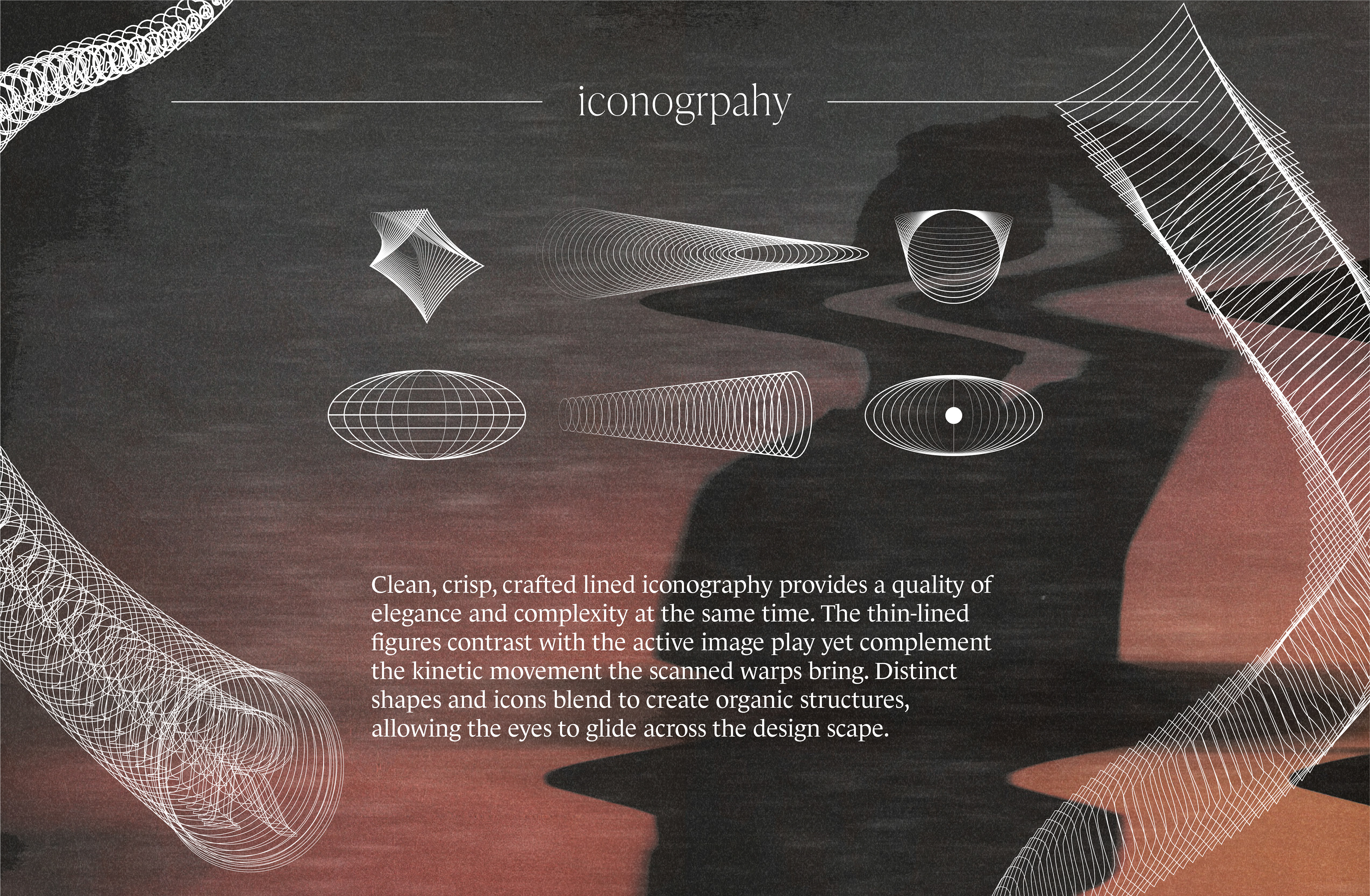
Play was at the forefront of the process. Quarantining created a chance for experimentation with (flexible and unique media). Image treatment and liner iconography presented a flexible and unique approach.
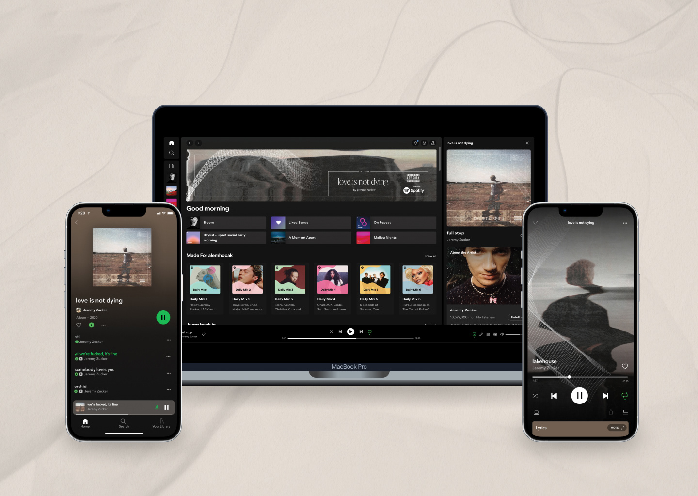
love is not dying Brand Applications